Children's Books
Miss Peregrines Journal for Peculiar Children
Malory Towers: 12: Goodbye
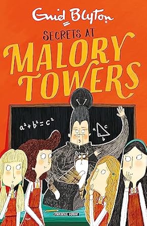
Malory Towers: 11: Secrets
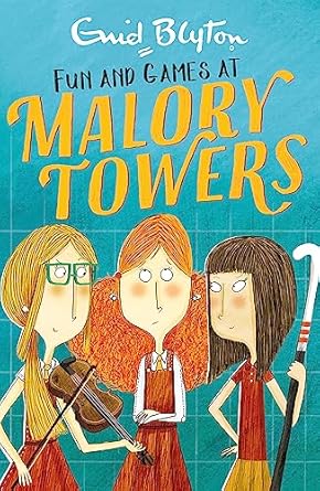
Malory Towers: 10: Fun And Games
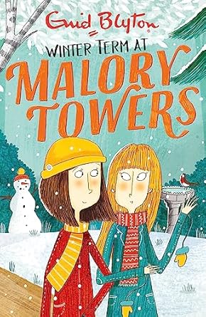
Malory Towers: 09: Winter Term
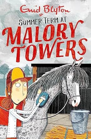
Malory Towers: 08: Summer Term
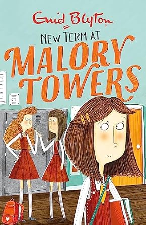
Malory Towers: 07: New Term
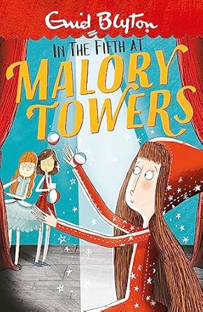
Malory Towers: 05: In The Fifth
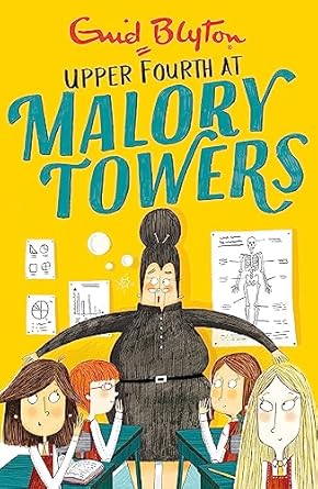
Malory Towers: 04: Upper Fourth
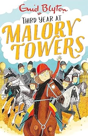
Malory Towers: 03: Third Year
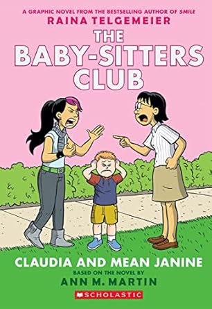
THE BABY-SITTERS CLUB GRAPHIX#04 CLAUDIA AND MEAN JANINE: FULL-COLOR EDITION
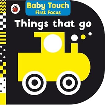
Things That Go: Baby Touch First Focus
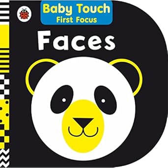
Faces: Baby Touch First Focus
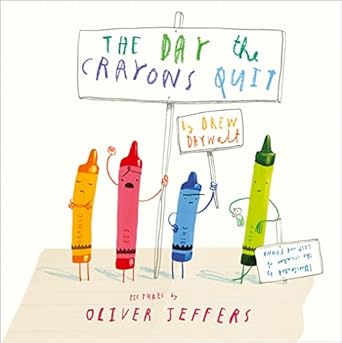
Day the Crayons Quit
MAGIC TREE HOUSE#23: High Time for Heroes
Online store of household appliances and electronics
Then the question arises: where’s the content? Not there yet? That’s not so bad, there’s dummy copy to the rescue. But worse, what if the fish doesn’t fit in the can, the foot’s to big for the boot? Or to small? To short sentences, to many headings, images too large for the proposed design, or too small, or they fit in but it looks iffy for reasons.
A client that’s unhappy for a reason is a problem, a client that’s unhappy though he or her can’t quite put a finger on it is worse. Chances are there wasn’t collaboration, communication, and checkpoints, there wasn’t a process agreed upon or specified with the granularity required. It’s content strategy gone awry right from the start. If that’s what you think how bout the other way around? How can you evaluate content without design? No typography, no colors, no layout, no styles, all those things that convey the important signals that go beyond the mere textual, hierarchies of information, weight, emphasis, oblique stresses, priorities, all those subtle cues that also have visual and emotional appeal to the reader.


